Are you curious about creating your first React component but don’t know where to start?
In this guide, we'll walk through the basic building blocks of React called components. I'll explain them in simple terms so you can quickly start building your own React apps and write better code.
This post also breaks down the essentials, providing clear examples to guide you, simplifying the concepts, giving you a clear, step-by-step path to mastering your React component creation.
What is a component?
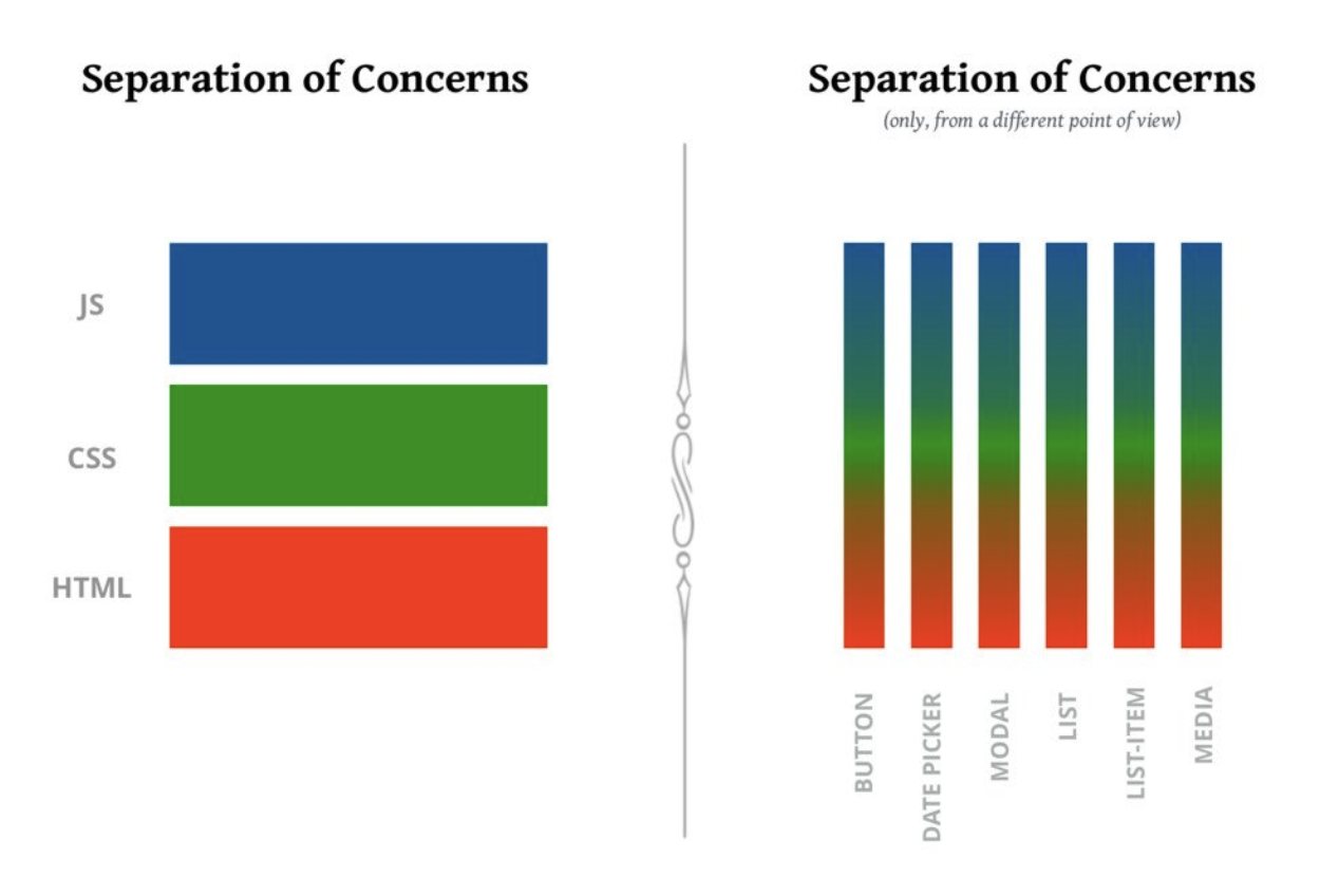
A component is a bundle* that combines markup, styles, and logic to control a specific part of the user interface.
This graphic illustrates this well:

Basic syntax
Let’s look at some code, and see how it works:
In React, components are defined as JavaScript functions. Typically, React components return one or more React elements.
Since React V16.8, the React team recommends using functional components for new development as they provide a simpler and more concise way of building React apps. Class components are still supported tho.
The component above, WelcomeHome, creates a React element that describes element that describes a paragraph, with some built-in styles. For simplicity, we’re using inline styles here.
We render a component the same way we render an HTML tag. Instead of rendering a <div> or an <h1>, we render a <WelcomeHome>.
JavaScript offers two ways to write functions: the traditional syntax using the
function keyword and the more concise “arrow functions”.Which sort of function should we use when defining React components? The short answer: it doesn't matter. They both work exactly the same way.
There are some functional limitations when it comes to arrow functions, like not having their own this value, and not being constructor-friendly. But when it comes to React components, none of these limitations are relevant. Arrow functions work just as well as traditional functions.
The big component rule
React components need to start with a Capital Letter. This is how the JSX compiler can tell whether we're trying to render a built-in HTML tag, or a custom React component.
The convention is to use PascalCase* for all React component names, though technically it's only the first letter that truly matters. We could name it Welcomehome, but it's much more conventional to go with WelcomeHome.
Props
Props are a way to send information to your components - just like when you give instructions to a friend. When you use props, you can make your components show different things based on what information you give them, making them more flexible and reusable.
Here is an example with our previous component WelcomeHome:
Default value
Let's suppose we're working on our WelcomeHome component. We want to greet the user, but there's a problem: We don't know everyone's name.
We could do this in React by specifying default values:
function WelcomeHome({ name }) {
  return (
    <p>
      Welcome Home {name} !
    </p>
  );
}
Here's another example. We have a decorative “VerticalRule” component, essentially a way to draw a line between sections. It has a default width of 150px, but we can override that value:
function VerticalRule({ size = '150px' }) {
  return (
    <div style={{ width: size }}>
      {/* Line-drawing code here */}
    </div>
  );
}

<VerticalRule size="250px" /> // Will be "250px"
<VerticalRule />              // Will be "150px"
Another option for setting fallback values is with the Nullish Coalescing operator.
function WelcomeHome({ name }) {return ( <p>Hey {name ?? 'there'}!</p>);}If you haven't seen this operator yet, it's very similar to
||, but it only guards against nullish values (null and undefined). It means we don't have to worry about “surprising” falsy values like 0.In my experience, the "default values" way is just easier when working with React props. I love that I can see all the backup values in one spot, and it helps me keep things consistent whenever I use those props in my code.
The children prop
Imagine we want to create a custom button component. We want it to behave exactly like a regular HTML button, but with a specific style: a green background and white text.
We could write it like this:
function GreenButton({ content }) {
  return (
    <button
      style={{
        color: 'white',
        backgroundColor: 'red',
      }}
    >
      {content}
    </button>
  );
}
And then we’d use it like this:
root.render(
	<GreenButton content="Click me please"  />
)
This works, but it's quite different from how we normally use HTML buttons, where we place the content between opening and closing tags:
<button>
  Click me please
</button>
As a nice bit of syntactic sugar, React lets us do the same thing with our custom components:
root.render(
  <GreenButton>
    Click me please
  </RedButton>
);
When we do this, we can access the children through the children prop:
function GreenButton({ children }) {
  return (
    <button
      style={{
        color: 'white',
        backgroundColor: 'red',
      }}
    >
      {children}
    </button>
  );
}
Think of this as a helpful shortcut React gives us.
It's like when you put something between two tags, React automatically takes that content and hands it to us in a neat package calledchildren. Pretty convenient, tbh.
children is a special value, a “reserved word” when it comes to props.
If we wanted to, we could pass children in the "traditional" way. It’s weird to do so, but the outcome is the same.
What happens if we pass both "forms" of the children prop?
It appears that React chooses to prioritize the children passed in-between the open/close tags <> … </>.
Closing
Now that you know the basics of React components, it's time to get your hands dirty! Jump in and build something cool - even if it's small. The more you play around with it, the better you'll get. Trust me, before you know it, you'll be building awesome stuff!

🔍. Similar posts
How to Delete All Content in a File Using Vim
28 Sep 2025
How to Generate a Git SSH Key on Your Mac and Add it to GitHub
31 Aug 2025
Why Are My React Components Re-rendering Too Much?
26 Jul 2025